Quantcast
Channel: Art Of Watercolor
Viewing all 187 articles
Browse latest View live

Breaking news! Alvaro`s Demo Downloadable!


Some Watercolor Beauty

$
0
0
Robert Wade. Italian Sketch.

Alessio Schiattarella

Bjorn Bernstrom

Iain Stewart

Francisco Castro

Endre Penovac

John Lovett

Liu Yi

 Milind Mulick

Peto Poghosyan

Raghunath Sahoo

Ping Long

Ramesh Jhawar. Varanasi No3

Sadhu Aliyur

Sanjay Dhawale

Samir Mondal

Merry Christmas!

Christmas Shopping

$
0
0
I`ve just unpacked a parcel from Australia for my publisher. Here I am sharing a new piece for his collection. The one and only Z!

Joseph Zbukvic. Coffee Time. 35x51 cm. 2013

Sergey Temerev Interview

$
0
0
Interview with a watercolor artist from Vyborg, Russia - Sergey Temerev.

What is Watercolor for you?
“Watercolor for me is testing of my strength, passion and recreation”. It is said on the front page of my site.

How do you build you relationship with watercolor?
...sometimes successfully too… Should I tell about something mutual? “… "testing of my strength, passion and recreation” – these words display my attitude to the media as a practice. Practice is a basis of experience that suggests that you will be able to understand something. There are elements of a play, a competition and of a ritual in my experience of painting with watercolors. Watercolor practice let me expectantly find myself in a right (at least for myself) relation with not only watercolor but the world in general, and to be in that state to the limit collected and quick, free from thoughts and doubts formed in words.

Sergey Temerev

When you start painting, do you think of the result?
Yes if you consider the result is honestly committed attempt to achieve what you conceived. The attempt might fail but also might bring unexpected finds. I am ready for both. When I start I know that I will finish. If you say about another understanding of result – I don`t know. There are might be many of those.

Sergey Temerev. Neutralitet. 35x56cm. 2012

What is the ratio of control and spontaneity in you work with watercolor?
About 50 x 50. Without concentrated attention keeping in mind all parts of the painting one can hope only for a casual luck. You need a clear sight to see spontaneously arising beauty of blending colors to be able to accept an unexpected present against the previous conception.

Sergey Temerev. Night Train. 35x56cm. 2012

Do you have favorite subjects?
Sea. Evening and night city. Subjects painted as they are.

What does inspire you?
A lot of things. Complicated in simple. Something from impressions that is kept by memory. What inspires is… woman`s beauty, nice weather and news, new brushes and paints, untouched paper – the list can be long…

Sergey Temerev. North-West Wind. 35x56 cm. 2013

Do you try to imitate a model or you use imagination?
Imagination is not switched off as well as memory. You can`t do without model too. Subtle nuances of light and color you can capture only with a model. But I paint with a model not very often. As usual my painting is based on observation, memory, small linear sketches from a notebook – taken from life or imagination. I don`t do an outline drawing before start painting. When I start I have only a white sheet before me.

Sergey Temerev. Sun Wind, Boat. 35x56 cm. 2012

What size of paper is the most comfort for you?
Doesn`t matter. After working on a series of paintings in one size it happens difficult but challenging to change to a larger or a smaller size. Lately the most typical sizes are the Imperial size – a standard sheet 56x76 cm, a half of it or a part of it.

Sergey Temerev. 25x63 cm. 2012

Do you paint in one go or you come back to started works?
I paint almost always in one session. It is a part of my method: I start painting on required condition of moist paper and trying to finish the session before the paper is dry. Sometimes it goes differently. If it happens that I have to interrupt the process I make an attempt to moist the paper again. If the painting is left unfinished for a long time its destiny is to be gone to the paper storage.

Sergey Temerev.

What is your criteria that the painting is completed?
Sometimes the awareness that the painting is completed comes in the beginning of work. Then you have to avoid spoiling it. Sometimes when finishing (when paper is dry and I am tired) I don`t know whether I am happy with result or not. Then the painting is left to dry before I have a new, fresh glance at it. The criteria generally is if I achieved the aim I started it for the sake of.

Sergey Temerev

Do you have the “must” colors?
There are colors in my “White Nights” box that I am running out of fast of all. It says that I more rarely use for instance violet and lemon yellow than ochre or cobalt blue. It also depends on what I am painting. Faster than others I am running out of Cobalt blue, ultramarine, green and madder red. Almost as fast as raw umber, gold ochre and English red. That means I think that I am using those paints more often. Are the “must” colors? No.

Sergey Temerev. On The Way, By The Way. 2012

What is more important in watercolor – brushes, paper or paints?
I would think over what to put in first place – brushes or paper, leaving the paints in the end of the list. The paper quality is important for me – it has to be useful for different kind of work and it has to save its internals and surface. Both require a careful choice of high quality paper. I used to paint in big variety of paper. Nowadays my sympathy is shared between Arches and Saunders Waterford of 300 gm.

Sergey Temerev, 35x56 cm. 2011

I can take any brush available. I can take a sponge instead, but the better brush the more pleasant the process of painting. I prefer big pointed mop brushes and one inch flat brush.
I can be limited in colors. I can paint with those of not high quality. The work painted with 2-3 colors, even a monochromatic work - I would call nothing else but painting, but it should have a clear tonal structure and rich nuances. So I think: first is paper, brushes are important but only after paper, and the paints in the end.

Sergey Temerev. Winter. 35x56 cm. 2011

What is more important for students – to see or to know how?
Seeing without skill doesn`t bring anywhere. Skills without attentive observation are also fruitless. So, both are important.

Sergey Temerev

What does teaching give you?
I am a docent of the Architecture and Art metal department of Art Industrial Academy. I am teaching composition. It has as much to do with watercolor as with any other medium. I am not talking about watercolor with students apart from their projects or attending exhibitions. Part of my answer to the question – it is interesting to me. I am interested in my colleagues and students. The other part of the answer – the teaching gives a chance to set important questions for students and myself and to answer them.

Impressions of Shenzhen Biennial

$
0
0
Great Event! Organized on a very high level. This kind of events bring watercolor medium to new standard in public attitude and in general. 230 artist works selected of 2800 submissions were represented at the show. Many artists from all over the world came personally to see the best of the media in Shenzhen. Here I am sharing some photographs shot at the opening...

K. Sterkhov with his painting.

 with Linda Baker (USA)

 with Keiko Tanabe (Japan/USA)

 with Linda Doll (USA)

 Keiko Tanabe, Laurin McCracken, Linda Baker

 with Ali Abbas Saed (Pakistan)

 with Chin-Lung Huang (Taiwan)

 Stanislaw Zoladz  (Sweden) with his wife

 Curator of the Biennial Zhou Tianya (China)

 Linda Baker (USA)

Pasqualino Fracasso (Italy), Laurin McCracken (USA) and me

 First Prize of the Biennial

 Ali Abbas Saed (Pakistan)

 Alvaro Castagnet (Urugway)

 Brian Stratton (Australia)

 Kathleen Conover (USA)

 Linda Doll (USA)

 Gran Prix of the Biennial

 Venue

 Keith Hornblower (UK)

 Ilya Ibryaev (Russia)

 Paul Jackson (USA)

 Janine Gallizia (France)

Keiko Tanabe (USA)

 Piet Lap (Holland)

 Atanas Matsoureff (Bulgaria), Mark Mehhaffey (USA)

 Petp Poghosyan (Armenia), Dean Mitchel (USA)

 David Poxon (UK)

 Prafull Sawant (India)

 Thomas W. Schaller (USA)

 David Taylor (Australia)

 Sergey Temerev (Russia)

Stanislaw Zoladz (Sweden)

Linda Baker Interview

$
0
0
Last month I met this incredible artist in Shenzhen Biennial. Linda Baker, AWS, NWS as a professional watercolor artist, is intrigued by the gentle translucence of nature. She considers her work to be a contemporary approach to traditional subject matter. Striving to simplify the complicated while seeing the unique in the ordinary, she captures the essence of gentle scenes with harmonious strokes.

Linda Baker. Laundry.

What is your background as an artist? How did you come to watercolor?
As an art major in college, I studied art but as is typical for a woman, I married and my life took twists and turns. My family was very involved with racing engines and technology so my art took a back seat. In 1989, I made a decision to leave the family business and pursue my art full time and I have never looked back. I started exhibiting and competing which moved into teaching. I have since had my work published and have two instructional DVD’s through Creative Catalyst Productions.

Linda Baker. Pins and String. 85x65 cm

Your painting gives me an impression of linocut by its discipline, accuracy and analyticity. Do you have an attempt to take a full control over the medium when you paint?
In college, I was very influenced with the process of printmaking and enjoyed the inking and mystery of what would be the outcome. I have carried this process over to my watercolor paintings. My paintings are alternating layers of resist and watercolor which create a build-up of patina and history in the work that satisfies my need for process.

Linda Baker. Escape Route. 76x56 cm

What in your opinion features watercolor from other mediums?
Watercolor has a luminosity and a transparency not seen in other medias. I love the build-up of glazes with all of the previous layers glowing through from the background. I think there is a depth of character in watercolor not accomplished with other materials. Your works have a very thought-out, considered composition.

How do you work on your painting?
I am a huge believer of the planning process in a painting. I love the process of drawing, arranging, and composing my subjects. I tend to select very mundane everyday subjects and add some magic through composition. It is my practice to plan carefully with thought and then paint with pure abandon where the paint is flying in every direction. The combination of the planned and chaotic is a certain spontaneity of color combinations and a rich textural surface.

Linda Baker. Shadow Dance. 75x56 cm

You chose quite saturated colors. Does the subject appeal to you that way or it is a special artist`s method?
Actually, what I choose are many layers of transparent color that build up to a richness that appears saturated. Upon careful observation of my surface, you will see many soft colors mingling and shining through what a glance appears saturated. This buildup of luminosity is a bit of a trademark for my work.

Linda Baker. What Goes Around.

I have noticed that one of the strongest artist`s means you take is rhythm and tonal contrast. Do you try to find a certain system when you paint your subjects?
It is interesting that you ask this particular question as it resonates with my work and my style. As a frequent juror, I am drawn first to the contrast in a painting. It is a belief of mine that if you have a strong composition and good contrast, you really cannot paint a bad painting. Contrast is one of the easiest ways to strengthen an image. Now rhythm is a separate issue. I love using repetition with variation to paint multiples of a simple subject such as bicycles. I love the feel of movement holding a painting together. Rhythm gives a painting a sense of cadence and entertainment. It offers movement for our eye and heart throughout a piece of artwork.

Linda Baker. Life Cyicles. 56x76 cm

I love how you are using white highlights. It brings sun into your painting. Can you tell more about this method of yours?
All painting is about light. Sometimes the light source is the entire meaning and in other works, the absence of light is significant. I am drawn to a strong light source where the light is dancing across the subject in an abstract form that actually creates a separate under or overpainting. Beams of sunlight, shadows dancing, and reflective light playing off the surfaces is what most of my work is all about.

Linda Baker. Quiet Sophistication. 76x56 cm

How do you find subjects that inspire you?
It is my belief, that my subjects find me. I can go out with my sketch pad and a camera all day and not find anything inspiring and then round a corner and have the most humble, everyday scene stop me in my tracks. I am not much of a tourist as I most often find myself down the alleys and in the middle of everyday culture and loving it!

How long does it take to finish a painting?
I generally work on a number of paintings at once. Being a process painter and loving the layering of my work, I rarely paint from beginning to end. Having said this, I generally spend a solid week, sometimes two on a work of art.

Linda Baker. Show Me The Money. 76x56 cm

Do you always work on one painting at a time?
I don’t remember a time when I did not have several paintings in the works at the same time. I love the sponteneity of switching gears and not getting too consumed by any image. By bouncing around, I feel that I keep the work fresh.

What is the most comfortable size to work on?
I like all sizes of paintings are drift around accordingly. I love a double elephant which is 30” x 42” but am just as comfortable with a small 12” x 12” square!! I try to let the image regulate what size it wants to be.

Do you paint on a spot?
Yes, I used to do quite a bit of plein air work but when I got so involved with the layering, I transitioned to more of a studio artist. I still love to go out and paint among nature and see what shows up on my paper!

Linda Baker. Stoned In Shadow.

Do you consider yourself a studio artist?
Because of the layering process and the drying required between layers, I have become more of a studio artist all the time. I can be the most productive with my techniques at my finger tips.

Your paper choice? Paints? Brushes?
My main paper choice was traditionally 300# cold-press Arches but lately I find that more of my work is on a smoother surface. I have been using Kilaminjaro 300# by Cheap Joe’s along with his brushes. I like many brands of paint for different reasons. Cheap Joe’s American Journey is great for pouring while M. Graham has a nice intensity for finishing strokes.

Do you use any additional medium besides transparent watercolor paints? Masking? Opaque paint?
I basically use only pure transparent watercolor pigment and always have. I am not a fan of opaque colors and certainly not stainers. With the layering in my work, the more transparent the better.

Linda Baker. Classic Elegance. 76x56 cm

Is it important for an artist to belong to official art organizations?
I think the art organizations offer a comraderie to a very solitary profession. Most artists work alone as it is the only way to find their own voice and the organizations help us to connect and stay on top of new techniques. I also enjoy giving back to an art world that has given so much to me.

Do you follow the news about art life of the artist fellows?
Yes, whenever possible, I get the magazines and art books so I can be aware of who is making a difference in the current art world. I always see work that inspires me or challenges me, and mostly makes me think. Can your art impressions influence your painting style? Without a doubt my art impressions influence my painting style. I was recently in Shenzhen for the Shenzhen Biennial and seeing work from all over the world impacted me more than I can say. It is fascinating what other cultures are doing the same and what they are doing differently and it is always interesting to see how this will impact my brush on paper.

Linda Baker. Anticipation V. 76x56 cm

Your advice to young watercolor artists?
My advice to young artists is to paint, paint, paint! No matter the knowledge you acquire, or the vastness of your art knowledge, it still comes down to the artist and the paper. The more we paint, the more we realize how much we have to say as an artist.

Some artist`s statement:

My subjects often choose me in that I see something and respond deeply to a scene that everyone else would have walked by. For example, my clothes pin series. I was doing laundry and dropped my clothes pins on the floor. They were just grey and weathered and yet the way the sun streamed across them intrigued me. The adding of color was so I could distinguish one pin from the other and so the series came to life. The clothes pins, it turns out are an International icon and recognized in every language. They also turned out to have a significant message between woman's work and men's careers and speak to our differences.

Linda Baker. Woven Patterns.

'His Keys' is a tribute to my late husband. In our chaotic life of racing, my husband built racing engines for every kind of high performance and each item had a key. With his business interests, he had buildings, tool boxes, storage units, and vehicles of all kinds each having a key. So, after my husband passed from an unexpected accident, instead of keeping his things which were too large and expensive, I kept his keys. I felt this was more intimate as each key in my collection he had touched on a daily basis. So, the painting…..a lifetime of memories.

Linda Baker. His Keys.

First Workshop in 2014

$
0
0
The topic was Seasons. I made 4 demonstration paintings - one of each season. Here are some photographs...

K. Sterkhov. Winter demo.

K. Sterkhov. Summer demo.

K. Sterkhov. Fall demo.

K. Sterkhov. Rose wet-in-wet.

K. Sterkhov. Winter demo. 35x53 cm

VOTSMUSH Interview

$
0
0
Inimitable and unlike anybody else artist Alexandr Shumtsov/Votsmush deserved a genuine recognition of intellectual part of the Internet audience although he has no art page of his own. Staying indipendent from official art institutions his Art keep gaining popularity and more fans.

Alexander, why did you take a nick name?
Because when I studied at the Theatre and Cinema Academy we lived at a student hostel. We were 4 people in the room. I would fix a notebook to the wall and announce that it would be a ship`s journal. Everyone would draw his portrait and write his nick name. I wrote my name conversely.

A. Votsmush

Do you identify yourself with your nick or your real name?
Lately with the nick name.

All right, then Alexander Votsmush. When watercolor medium entered your life?
Perhaps when I was attending a kindergarden, when I saw it the first time… Then consiously at the Art school, then even more consiously in Art college… I also was painting with watercolor when I was in army. But I really understood what it is all about in 1994. Then I knew where to go.

A. Votsmush

You live in Sevastopol, Crimea. Far away from the capitals of Art life. How have you become well known?
Have I? Probably there were some exhibitions, people liked them, someone even bought some pieces… There were many exhibitions, especially in 1990s, beginning of 2000s. And then Internet… my friends help me to post my pictures, they also write something…

Meeting with Alexander Votsmush for the interview

Are you consciously don`t use Internet?
I want to do it very much but it has been out of reach so far. I have to get into it, reply the letters… Perhaps I will have to come to it some day.

A. Votsmush

Where do you get your ideas from?
Actually everywhere. When I was a little boy, perhaps from fairytales and cinema, then from told stories, then I would start telling stories myself. Then we had a team of mates who would tell stories when they come together. …and the world around.

A. Votsmush

Do you prefer to collect material by your camera or by sketching?
Both.

…or you store it in your head?
All together. It is all interacts, then divides into components and then works. Everything is there already. Then you do something and you succeed… or you do not.

A. Votsmush

How do you get such saturation without overloading the paper? What paints do you use?
German paints from tubes. It`s very good when there is a large volume of liquid mixtures ready to paint. Just to take it with a brush and through to the paper.

What kind of brush?
Starting from broad flat bristle brush for wall painting to a simple pencil. Watercolor pencil is also good. Then adding hands, nails – all is in action…

A. Votsmush

Does it all happen spontaneously?
In impuls, in gust of dance with watercolor…

How do you get the precise white areas?
There is a masking fluid. Or you can also paint around. This is how I used to do, now I am using the masking.

A. Votsmush

What supplementary tricks do you use?
Masking, nails scratching, watercolor pencils…

Do you work on composition in advance or the drawing is born right on a paper?
I presumably know the principles of composition. First I am making a small draft with a gel pen or a pencil to avoid then unnecessary movements on the paper.

A. Votsmush

Do you consider your approach in watercolor more as painting or graphic?
I don`t know how to call it, more important that it should work for myself and the viewer.

I saw a spectacular edge of a sheet of your painting. How did you do that?
Just cut with a liner but not to the bone. Then tear slightly, cut and… everyone says oh! It`s a miracle, how did you do it?

A. Votsmush

What size of paper is most attractive for you to work on?
The largest possible. The largest I have done so far is 145x145 cm – it is very inspiring. That`s what is needed!

What kind of paper do you use?
Mainly the one with a smooth surface. There used to be a good paper – soviet Gosznak. Also I like a common drawing paper, Italian is better, it keeps the color. Arches satin is good but the color is fading.

A. Votsmush

The drawing paper is rather thin. How do you work on it – do you fix it?
I fix it on a boad. The largest size 145 (the width of a roll paper is 150 cm).

What do you stress in your work with student?
Maybe they have to remember the time when they were children, first impression of everything, when they were surprised by everything around… first emotions should be combined with the present experience, they have to drop all unnecessary, that disturbs… to combine the qualities of an adult person without extra gloomy attitude, with the state of mind of a child when he was surprised the first time.

A. Votsmush

How important is imagination in work of an artist?
For me it`s important, for someone it`s difficult. Imagination can be developed or you have to be born with it.

What is more important for you – the process or the result?
50x50. For instance you are cooking a cake, prepare the components and thinking, what a wonderful cake would it be… When you are ready with it everyone likes it… or doesn`t, if you didn`t succeed.

A. Votsmush

Do you follow the art life? Are you interested in art of your artist fellows?
I am very interested. Today you gave me your book, and there were artists I saw in the Internet, I like them very much… but I don`t follow, perhaps I should be more interested…

Do you need to integrate into the Art life or his or her creativity is sufficient for an artist?
It`s rather cool to participate in worthy events.

Do you have any rules?
Of course, some, I think.

Are those rulesinvented by you?
Probably those rules are convenient for me.

Repin Academy of Fine Arts - Students` Winter Exhibition

$
0
0
Yesterday I visited the exhibition of students works in Repin Fine Art Academy, St.Petersburg, Russia. It was a winter exhibition where students exposed what they did for the last half-a-year. I focused on the works of the graphic department as they use more water media, but there are also some photos from the painting department. Enjoy!

Repin Academy of Fine Arts

Some studios from the Painting Department.


A passage.


Some works from the Graphic Department.


It was a great feeling to come back after many years. I found out that not much has changes since I was a student. However it was a nice push for myself, hands are itching to get my brushes and to start painting...

Samir Mondal Interview

$
0
0
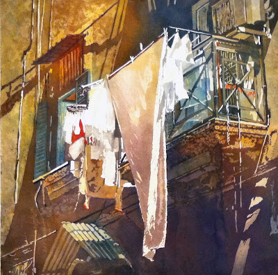
Samir Mondal’s most amazing contribution to Indian art of modern times is a continual revival of watercolour. Born in 1952 in India. He has endowed watercolour with the status of oils, projecting a facet of watercolour that was never visualized before. The artist keenly observed the characteristics of oil painting, noted the inherent quality, their richness and substance. In his endeavour to include these elements in watercolour, he developed textures and structural features as if they are oils. Samir Mondal has stood the test of this fantastic versatility. His watercolours have never lost their originality, their innovativeness and their classic elegance, yet they are truly modern paintings (www.samirmondal.com).

What are the main tendencies of the art of watercolor in India?
Indian art today has changed a lot, and is surprisingly not much related to the Indian culture now, but very much influenced from western art movements. Like other countries India too is obsessed with modern and quicker mediums like acrylic and freer with mixed media. In India the use of watercolour was a tradition. Be it Frescoes, scroll paintings, miniature paintings and manuscripts. Sad as to why we are losing our root, or is it a step in evolving towards the global community? Watercolour is not a very popular medium amongst the Indian artists. It is thought of a medium that students would use only for outdoor study of landscapes.

Samir Mondal. Ganesh

When did you realize that the classic approach is not sufficient for you?
I thought of moving away from the traditional application of watercolour after finishing art school. Government Art College, Calcutta, being a very British institute, exposed me to orthodox watercolour techniques of the British masters. The transparency and the magical three-dimensional aspects of watercolour enthralled me as I began my student life, but now with the advent of camera, which can truly capture perspective and dimensions flawlessly. Chinese watercolour with bold brush strokes, Egyptian hieroglyphics with simplified motifs, prehistoric cave paintings, frescoes from Ajanta Caves in India gave me some light. It made me think that contemporary use of watercolour was still very much unexplored, not only in India but everywhere else. I tried to experiment by incorporating bolder brush strokes, inspired by the Chinese watercolour and by placing simplified motifs like hieroglyphs, in a two dimensional plain. I tried my best to break the traditionalism by incorporating definite structure and bolder colour to my style.

Samir Mondal. Boats.

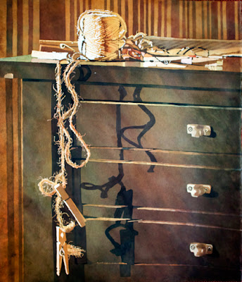
What did you have as inspiring sources to find your own voice in art?
My works are a juxtaposition of objects and visuals that cannot be related with when viewed individually, but together they represent the complexity of our modern society. I am always inspired by my surroundings and the circumstances. I painted a series called ‘The shelter’ when I was going through a tough time to accumulate money for my room rent in Kolkata. In a painting from it, I chose to use a ‘turtle shell’ as a symbol to represent minimal shelter for existence in a metropolis. At the same time I was heavily involved with Dramatics and Pantomime. For sure these influenced my themes then with much figurative inputs. During the gulf war, I painted a series - ‘The War, The Butterflies’. With the satellite television coming in or rather exposure to western music videos, I started incorporating many pop, jazzy and punk themes into my works. A more contemporary series that I have done is titled ‘Let’s Rock’ which involves a lot of punk and pop motifs, strong graphic visuals, dynamic colours and definite structures. All these inspired by a complex modern social lifestyle in Mumbai. Some of the other popular series are ‘Alisha’, ‘Torso’, ‘Kitchen’, ‘Reminiscences’, ‘Performer’ and ‘Drama framed’.

Samir Mondal. Embrace.

Did you work in other mediums than watercolor?
No. I am determinedly dedicated to this medium. Watercolour is my tool or weapon to express.

Why did you choose watercolor as your major medium?
Not major. It’s my medium. I have never experimented with any other medium. I was born near a river, a riverbank in a rural village in West Bengal. Water was an integral part of my life, and they say if you are born near a river you should sing or paint. In early childhood in rural Bengal we played and experimented with natural colours which were readily available like ash, red clay, flower petals, leaves etc. All these materials were water-soluble. May be watercolour is something which I grew up with and comfortable with this, but also this medium is something which offers me immense satisfaction and a feeling of accomplishment. Even today I feel there is much more to be explored in this medium and the possibilities of what can be achieved are limitless.

Samir Mondal. Blue Flowers.

When I was in India I was amazed that all brightest colors possible were not competing with each other, whether it was textile, clothes of people or just colors in the street. I can see that effect in your painting too. Is that harmony natural in India or all credits go to the work of artists and designers?
Yes you are right. India has a variety in land patterns, climatic conditions, coloured clothing, and of course the traditional folk art. This harmony always works at the back of my head, but in modern times, in urban city life, we see colours in a newer way. Billboards sprung up all over, with so much of colour and light at night, these had to be incorporated into my works. Later when I was involved with fashion magazines my themes and works became more colourful, vibrant with urban symbols. Frankly, my colours are from the search for creating a contemporary visual language. I am a great fan of Fauvist- Henri Matisse, who proved that it doesn’t matter what colour is used where; it may be absurd yet poetic at the same time.

Samir Mondal. Monsoon. 55x75 cm

Do you have sort of “must” colors?
Not really, but if I scan through my past, I get that there are some phases where I was obsessed with some particular colour. Red was mostly there to get the warmth. To be precise, Alizaine Crimson was mostly used in a majority of paintings.

Samir Mondal. Flames Of The Forest. 75x105 cm

Which paints do you run out of first of all?
Ivory black.

Do you consider black as a color?
Academically we were taught never to touch the black and white tubes of watercolour while practicing in this medium. The impression then was that black makes the transparent medium dirty. In my quest to diverge from the traditional school of watercolour and experimentation, I discovered that application of Black in my works gave it weight and strength. The little opacity created, helps in enhancing the transparency of its surroundings. Use of black as black enhances the contrasts or rather brings out a different dimension with other darker shades like crimson, ultramarine, viridian green etc. Black is really great if it is placed properly. One has to be very careful.

Samir Mondal. Portrait. 75x55 cm

Do you have a particular type of paper that you use?
No. It depends on the effect I want. I was using Indian handmade papers, then Whatman and Saunders, now Arches cold press and rough.

Which size of painting helps you better to realize yourself?
I like large format. At least a full imperial is good enough to feel free. Bigger the area, biggest the fun.

Samir Mondal. Orange Flowers.

How do you work on a painting? Is it a planned or a spontaneous process?
I always plan my theme, sure about composition but play with colour spontaneously.

Can watercolor painting be corrected?
Yes. There are many ways you can correct you painting. It is just a fear or excuse.

What are your “do” and “don`t” in watercolor?
Do whatever you like. Don’t be afraid.

Samir Mondal. Red Flower.

What was your experience of work on Taare Zameen Par? Did you have other experience of working for big cinema production? Was it useful for your artist experience?
One must recall that in the film Taare zameen Par, art was used symbolically as an emancipator, giving a challenged child his deserved freedom. The art was the protagonist. Apart from coaching Aamir Khan, as he was acting for the role of an art teacher, I had to paint for his character and the most interesting and scary was the child’s artwork that I had to paint. The paintings were used at the climax of the film in a very meaningful manner. The film was short listed and selected for Oscar nomination that year and with it I became ‘Taare Zameen Par man’ overnight from my usual title - the watercolour man. This response is possible only with cinema. One can reach out to a bigger audience. After that I have not worked with any other production.

Samir Mondal. Taare Zameen Par. 75x55 cm

I am practicing sahaja yoga with all my family for over 20 years. India is famous as a country with rich spiritual traditions. As an Indian artist can you say what part do these traditions take in Art life? In your Art?
Working with watercolour almost gives like a meditative mood. Watercolour is a very powerful and interactive medium. When I work I feel at peace in a sort of meditative trance. I enjoy the melody that the medium plays out; arrays of tones, the mixing and merging; all this have a sort of magical and spiritual feel to it. Spirituality may creep into my themes in the near future.

Samir Mondal. Still life. 36x26 cm

What are the criteria to evaluate the art piece?
Consistency and the previous works of an artist and quality are important. One should check whether common idea or different thought process is the main criteria for the artist. Are the technical elements contributing to the mood, meaning, or aesthetics? The painter should have faith on his culture and sincerity to the work for sustainable period.

Samir Mondal

What make the watercolor so special for you?
Watercolour is a naughty and at the same time friendly medium. When I paint, I feel the medium is playing with me, I try to achieve something but the medium gives me something else. This unpredictability is what makes this medium so special to me.

Meeting Angus in Moscow

$
0
0
Last week I had a workshop in Moscow and, it happened that another watercolor artist from UK had his workshop there as well. Thanks to the organizers we could meet on Saturday night for a cup of coffee. It was fun!

Me and Angus McEwan (UK), the winner of the III prize in Shenzhen Biennial.

Angus McEvan`s painting

 Evgenia (Art-Holidays), Margarita (Bratets Lis), Angus McEwan and Tatiana

Farewell, goodnight!

Workshop "Landscape. All Seasons in 2 Days".

$
0
0
The workshop that took place last weekend in Moscow was successful. The participants had an opportunity to try (so did I) watercolor paper by Hahnemuhle (Germany). It is much softer than my favorite Saunders Waterford (UK) but it is always fun to try something new. Here are some photos from the workshop.


From the Paperworld exhibition I had some blocks presented to me by Hahnemuhle. That were Sezanne, Turner - 300 gm and Leonardo - 600 gm.

 K. Sterkhov. Hahnemuhle, Sezanne, 300 gm, 30x40 cm

  K. Sterkhov. Hahnemuhle, Turner, 300 gm, 30x40 cm

  K. Sterkhov. Hahnemuhle, Turner, 300 gm, 30x40 cm

  K. Sterkhov. Hahnemuhle, Sezanne, 300 gm, 30x40 cm

 K. Sterkhov. Hahnemuhle, Sezanne, 300 gm, 30x40 cm

Creative World, Frankfurt

$
0
0
New meetings, new agreements, new perspectives...

 Meeting Escoda (Spain)

 New set of signature brushes - David Taylor

 New set of signature brushes - Robert Wade

New set of signature brushes - John Yardley

The Nevskaya Palitra (St.Petersburg) booth - my paints!

Hahnemuhle - watercolor paper from Germany since 1490!

St. Cuthberts Mill (UK) - they make Saunders Waterford! My favorite!

Daniel Smith (USA) - watercolor paints that represented by Zbukvic, Castagnet, Taylor , Stewart and Andersson. Good company, isn`t it?

At my booth, brushes by Roubloff who makes my signature brushes, St.Cuthberts Mill manager is attending my demo.

 K. Sterkhov. Demo on Lilia Holding paper "Palazzo" with White Nights paints.

 K. Sterkhov. Demo on Lilia Holding paper "Palazzo" with Schminke paints.

Coming soon! Masters of Watercolor II


Some Random Paintings

$
0
0
There is always something to inspire...!

Anders Zorn (Sweden)

Alvaro Castagnet. Downtown Melbourne.

Joseph Zbukvic. New York City.

Linda Baker. Standing Along.

Kathleen Conover

Thomas w. Schaller. Somewhere Summer.

Guangxi International Exhibition Seminar, Oct. 2013

$
0
0
Guangxi international exhibition seminar and painting session in October, 2013.
For those who were not following the news of watercolor on FB here is a review of a great art trip of renown artists. Enjoy! The photos have been taken from pages of Liu Yi, Igor Sava, Joseph Zbukvic and Chin Li. Here we come...

 Liu Yi, Joseph Zbukvic

 Ong Kim Seng, Liu Yi

 International group of painters

Liu Yi is painting a portrait of Ong Kim Seng

 John Salminen

 John and Cathy Salminen

 Joseph Zbukvic

 John Salminen and Liu Yi

 Joseph Zbukvic, Liu Yi

 Ong Kim Seng, Liu Yi, Igor Sava

 Joseph Zbukvic

 Ong Kim Seng

 A little break

 International group of artists

 Mary White

 John Salminen

 Ong Kim Seng

 Ong Kim Seng, Liu Yi

Igor Sava

Zbukvic, Castagnet and Pekel Painting Together!

IWS Young Artists Contest Results

$
0
0
International Watercolour Society, Turkey has hold a contest for young artists of age before 35 years old. Here I am sharing with you the results. As one of the jurors I am happy that some of the major winners match the same that I have selected.

 1 Place. Li Jia, 26 year old (CHINA). Swim. 52x98 cm

2 Place.Li Chao 24 years old, (CHINA). The Memory Of That Time. 76x110

3 Place Cai Ya Ming, 23years old (CHINA) Thinking Of Tomorrow. 120x80 sm

4 Place. Yang Di Jun, 24 years old (CHINA). The Peace Moment, 100x70sm

5 Place. Lin Chin Che, 27 years old (Taiwan). Memory Lane

6 Place. Lin Wei Xin, 35 years old (Taiwan) Lying Quietly

7 Place. Alexis Le Borgne, 18 years old (France). 61x48 sm

8 Place. Tian Yuan, 27 years old (CHINA) Golden Symphony. 106x75 sm

9 Place. Silvia Cusinato, 35 years old (Italy) New Year Day, 30x40sm

10 Place. Keiran Chang, 20 years old (Taiwan) When Pine Goes Nuts. 20x40 sm

I also would like to announce that International Watercolor Society is represented now in Russia. It is not considered yet who is going to represent the RU-brand of it but it will be shortly...


Fresh and Bright

$
0
0
Peto Poghosyan. Above. 56x76 cm

Ping Long

Ping Long

Ping Long

Endre Penovac

JoanCochRey. Peniscola

Can Zhui Wei
Viewing all 187 articles
Browse latest View live


Latest Images

<script src="https://jsc.adskeeper.com/r/s/rssing.com.1596347.js" async> </script>
<script src="https://jsc.adskeeper.com/r/s/rssing.com.1596344.js" async> </script>